From Data to Action: Visualizing Your Fitness Journey with Advanced Data Visualizations”
Embarking on a fitness journey involves more than just collecting data—it’s about transforming that data into actionable insights. Aether, powered by TikTik, redefines the landscape by presenting sophisticated data visualizations that connect the dots between various metrics, weaving a narrative of your fitness cum lifestyle transformation. This use case provides a guided tour through Aether’s visual symphony, highlighting how it seamlessly connects sleep metrics with the duration of workout, resting heart rate, and heart zones.
Use Case: Touring Aether’s Integrated Data Visualizations
- Navigating the Integrated Fitness Landscape: Overview of Aether’s Visual Symphony
- Holistic Overview: Begin your tour by immersing yourself in Aether’s visually intuitive interface. Witness how diverse metrics, from sleep patterns to heart zones, are seamlessly integrated into a holistic visual representation of your fitness journey.
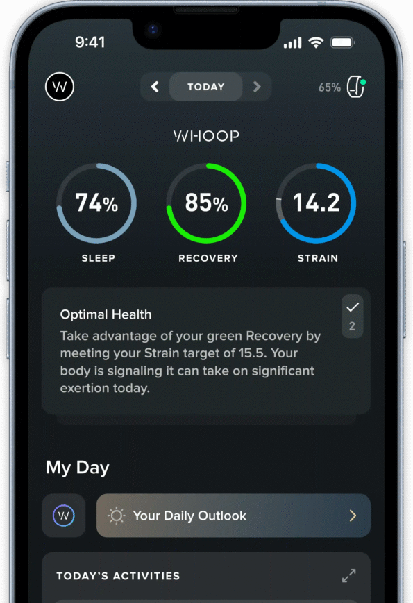
- Unified Dashboard: Explore the unified dashboard that connects sleep metrics, workout duration, resting heart rate, and heart zones. Gain a comprehensive view of your daily, weekly, and monthly activities, providing a roadmap for your fitness transformation.
- Sleep Metrics and Workout Duration: A Symbiotic Relationship
- Sleep-Workout Correlation: Delve into visualizations that bridge the gap between sleep metrics and workout duration. Witness how Aether establishes a symbiotic relationship, demonstrating how the quality and duration of your sleep influence the effectiveness of your workouts.
- Recovery Insights: Connect the dots between a night of quality sleep and enhanced workout performance. Visualize how Aether’s data visualizations offer insights into optimal workout times, intensity levels, and recovery periods based on your sleep patterns.
- Resting Heart Rate Trends: Visualizing Your Body’s Baseline
- Resting Heart Rate Graphs: Navigate through visual representations of resting heart rate trends over time. Witness how Aether’s visualizations provide a baseline for your cardiovascular health, allowing you to identify trends, anomalies, and correlations with other metrics.
- Stress and Recovery: Explore how resting heart rate visualizations become a key indicator of stress and recovery. Aether’s integrated approach helps you understand the impact of various lifestyle factors on your body’s baseline, facilitating more informed decisions for overall well-being.
- Heart Zones and Workout Intensity: Connecting Effort to Results
- Heart Zone Mapping: Uncover Aether’s visualization of heart zones during workouts. Understand how these visualizations connect the effort you put into different heart rate zones with the results achieved, fostering a more targeted and effective fitness regimen.
- Workout Effectiveness: Visualize the correlation between heart zones and workout effectiveness. Aether’s data visualizations empower you to adjust your training intensity, ensuring that your efforts align with your fitness goals, whether it’s weight loss, endurance, or cardiovascular health.
- Informed Decision-Making: Aether’s Visual Narratives for Action
- Actionable Insights: Connect the visual narratives offered by Aether’s data visualizations to actionable decision-making. See how the integration of sleep metrics, workout duration, resting heart rate, and heart zones guides you to make informed choices about your daily routine, workout plans, and recovery strategies.
- User-Centric Design: Appreciate the user-centric design that transforms complex data connections into clear visual signals. Aether’s approach ensures that every visualization serves as a tool for action, driving you towards a well-rounded fitness cum lifestyle transformation.
Conclusion: Aether’s Visual Symphony Unveils Your Transformation
In conclusion, Aether’s lifestyle watch orchestrates a visual symphony that goes beyond mere data representation. By seamlessly connecting sleep metrics with workout duration, resting heart rate, and heart zones, Aether transforms raw data into actionable insights. Take this guided tour through Aether’s interface, where your fitness journey becomes a narrative, guiding you toward well-rounded transformations in both your fitness and lifestyle.

