Aether Smartwatch, Artificial Intelligence, Data Benchmarking, Data Visualization, Duel Mode, Powered By TikTik, TikTik:Your Everyday Companion, Watch Features
Advanced Data Charts Used by TikTik: Your Everyday Companion
By adminadmintiktik. Posted on
Aether Powered By TikTik, as your everyday companion, leverages advanced data visualization techniques to provide users with comprehensive insights into their health, fitness, and daily activities. The following are some advanced data charts utilized by TikTik for a detailed and informative display of your data:
1. Biometric Trends Over Time:
- Line charts showcasing trends in biometric data such as heart rate, blood pressure, and sleep patterns over extended periods.
- Color-coded lines for different parameters offer a quick visual understanding of how each aspect evolves.
2. Fitness Progress Radar Chart:
- A radar chart depicting multiple fitness metrics like steps taken, calories burned, and exercise duration.
- Each axis represents a different metric, and the shape of the chart provides a holistic view of overall fitness progress.
3. Sleep Cycle Stages Pie Chart:
- A pie chart breaking down sleep cycles into stages (deep sleep, light sleep, REM) for each night.
- Color variations help users quickly identify the distribution of sleep stages, aiding in optimizing sleep quality.
4. Activity Heatmap:
- A heatmap displaying activity levels throughout the day, with color intensity indicating the intensity of physical activity.
- This visualization allows users to identify patterns in their daily routines and find optimal times for exercise.
5. Customizable Goals Bar Chart:
- Bar charts representing progress toward customizable fitness goals, such as daily step count or weekly workout duration.
- Users can set and adjust goals, and the chart visually tracks their journey towards achieving them.
6. Nutritional Intake Bubble Chart:
- A bubble chart illustrating nutritional intake, with each bubble representing a specific nutrient (e.g., calories, protein, carbs).
- Bubble size corresponds to the quantity consumed, and users can quickly assess the balance of their dietary choices.
7. Weather and Activity Correlation Scatter Plot:
- Scatter plots correlating weather conditions with various activities, helping users identify environmental factors influencing their exercise routines.
- The position of data points indicates the relationship between weather and activity intensity.
8. Heart Rate Zone Distribution Bar Graph:
- Bar graph displaying the distribution of heart rate zones during workouts.
- Different colors represent different heart rate zones, aiding users in optimizing their training for specific fitness goals.
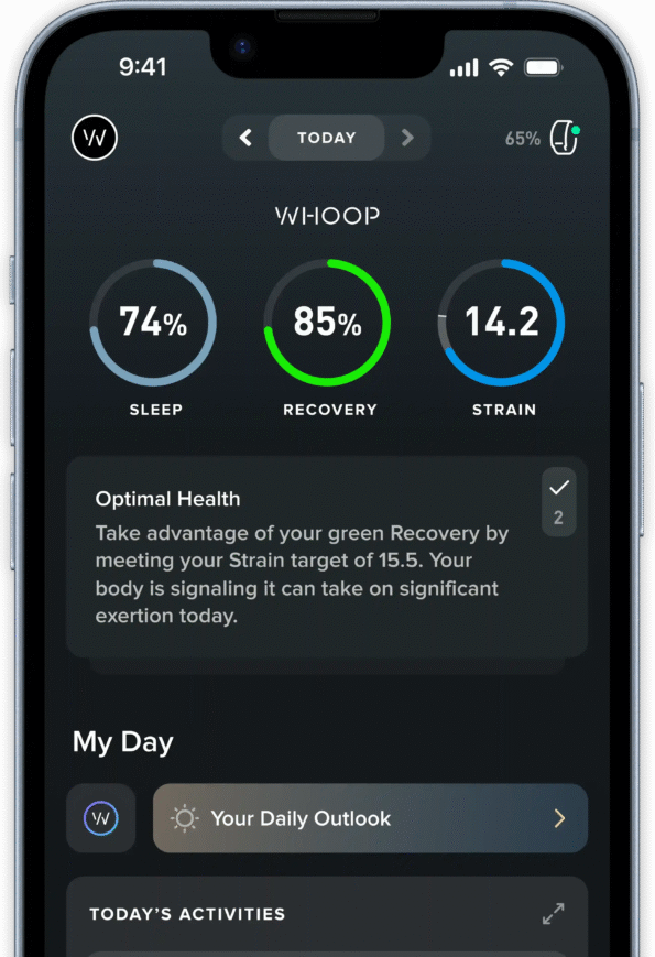
9. Customizable Dashboard Cards:
- Interactive dashboard cards that users can customize to display their preferred metrics.
- These cards provide at-a-glance information on steps, calories, sleep, and other personalized data.
10. Benchmarking and Comparative Line Chart:
- Line chart comparing personal fitness metrics with benchmark data, either based on user-defined goals or population averages.
- This visual aid allows users to gauge how their performance stacks up against their objectives or broader benchmarks.
These advanced data charts not only present information in a visually appealing manner but also empower users to make informed decisions about their health and wellness. TikTik’s commitment to advanced data visualization ensures that your everyday companion not only collects data but transforms it into actionable insights, fostering a holistic approach to well-being.

